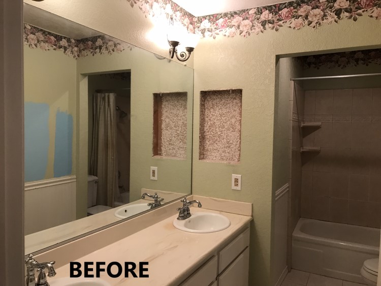
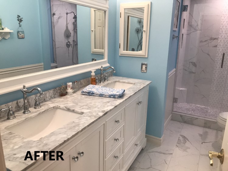
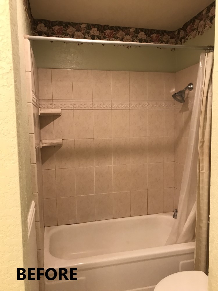
 Welcome to the recap of my latest home improvement project! While I had applied a few cosmetic upgrades to the guest bath years ago, the tub, vanity and flooring remained original to the house which was built in 1978. Both the shower and vanity faucets were now leaking and the bathtub had areas of rust. The wallpaper trim was peeling, the medicine cabinet was loose and crooked, and the space just really needed some help. Rather than attempting more piece-meal upgrades, I thought it was a good time to plunge into a bathroom remodel. And what an adventure it has been!
The fun part started with collecting ideas online and then picking out all new tile, cabinetry and fixtures. Unfortunately, the fun part didn’t last very long! I quickly learned that beautiful pictures you find online may include items that are a) not available for sale, b) not within your budget, or c) not workable as you envisioned in the planned bathroom of your dreams!
Beautiful mother-of-pearl mosaic tiles for example, might be suitable for a kitchen wall but not strong enough for a shower floor. The perfect shower niche can’t be installed where planned, because a gas line is inconveniently already occupying that space. And here in California, it is important to know that shower heads and sink faucets are regulated to dispense water at a lower flow rate than is allowed in other states. Initially, I shopped these by appearance—wanting a vintage look, only to find out that I couldn’t buy what I had selected because they were illegal to ship to my state! I did eventually find good alternatives that I could purchase, but it was a learning experience!
If I had to give this remodel theme a name it would be “Modern Vintage Flower.” I researched pictures of modern bathrooms that had a vintage feel. Then I narrowed down the elements that I liked in each picture, to get a sense of what I wanted to shoot for with my own remodel. In general, I settled on a blue robin’s egg paint color, in contrast to white wood, and white and gray marble tile. I liked accents in chrome and pewter. I looked for fixtures and accessories with vintage shapes and was drawn to materials with floral designs. When everything I liked came together, it turned out to be a unique combination of Victorian styling with a bit of retro flower power!
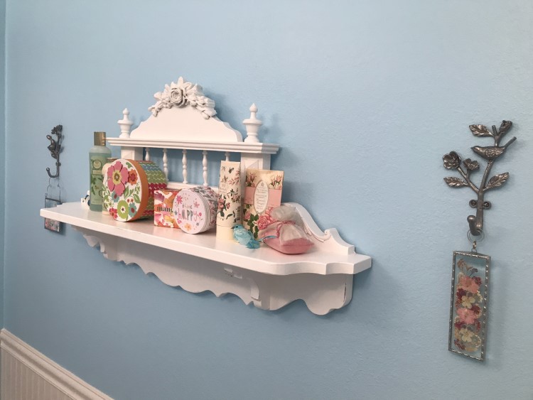
There were some items from the first cosmetic update that I wanted to keep—the pewter and glass wall sconce light fixtures, the bead board, the vintage-shaped toilet, a Victorian shelf and some silver wall plates. So, I worked in the new items to complement the pieces I wanted to keep, and everything else was gutted during demolition.
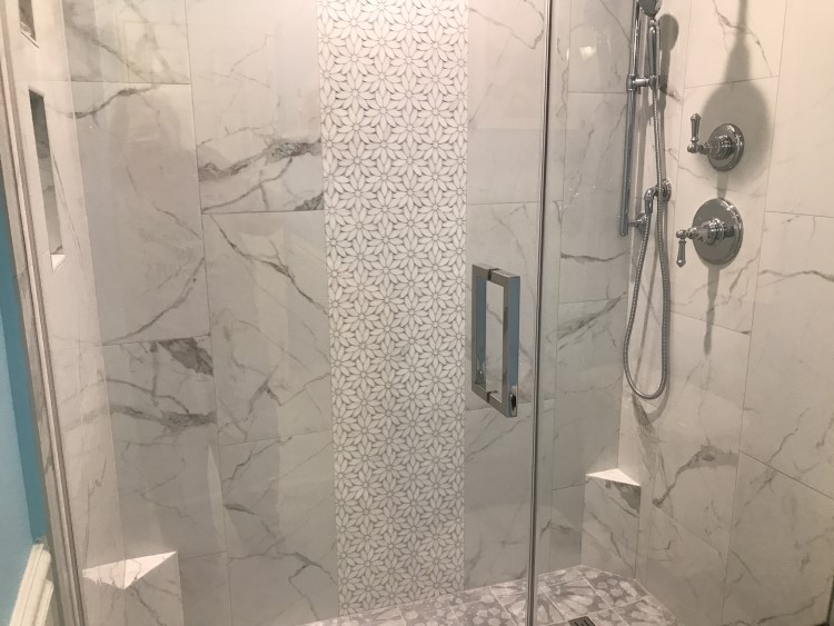
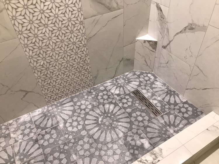
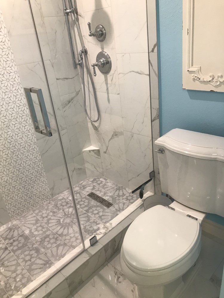
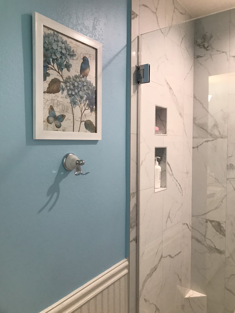
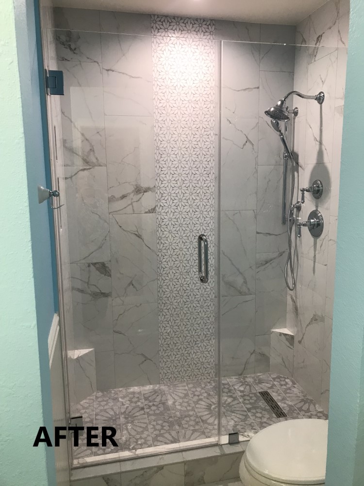
The biggest change to the new guest bath was the tub-to-shower conversion. Not only was this more practical for use, but the frameless glass enclosure made the space feel more open. I believe the showpiece of the new shower is the stunning floral mosaic vertical accent tile centered down the back wall. These interlocking daisy-shaped waterjet stone mosaics were purchased from Mineral Tiles, and each piece covers about one square foot.
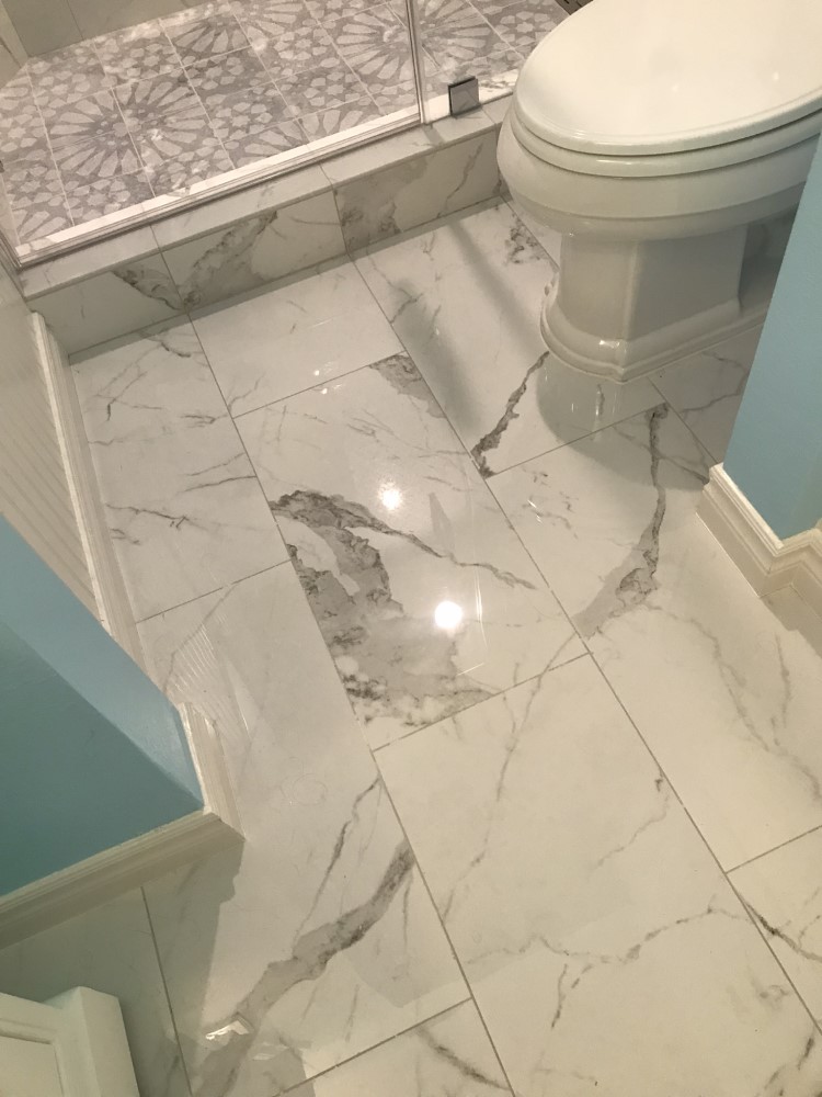
For the shower walls, I wanted a white marble look with just enough gray veining to make it interesting but not too busy. The Satori Statuario is a 12×24 inch polished porcelain tile from Lowes that worked perfectly in this space!
I found a shower pan tile with a modern flower design that I really loved, and thought it complemented the mosaic daisies very well. These are Viviano Marmo Marigold 12×12 inch gray honed marble tiles from Floor & Décor. Unfortunately, the tiles were really too big for the shower pan area as the size left little room for setting the drain slope. However, the more I looked for something smaller, the more I really wanted these tiles! Although it was more work for the installer, he cut each tile into four 6×6 squares, allowing him more leeway to set an appropriate slope toward the drain.
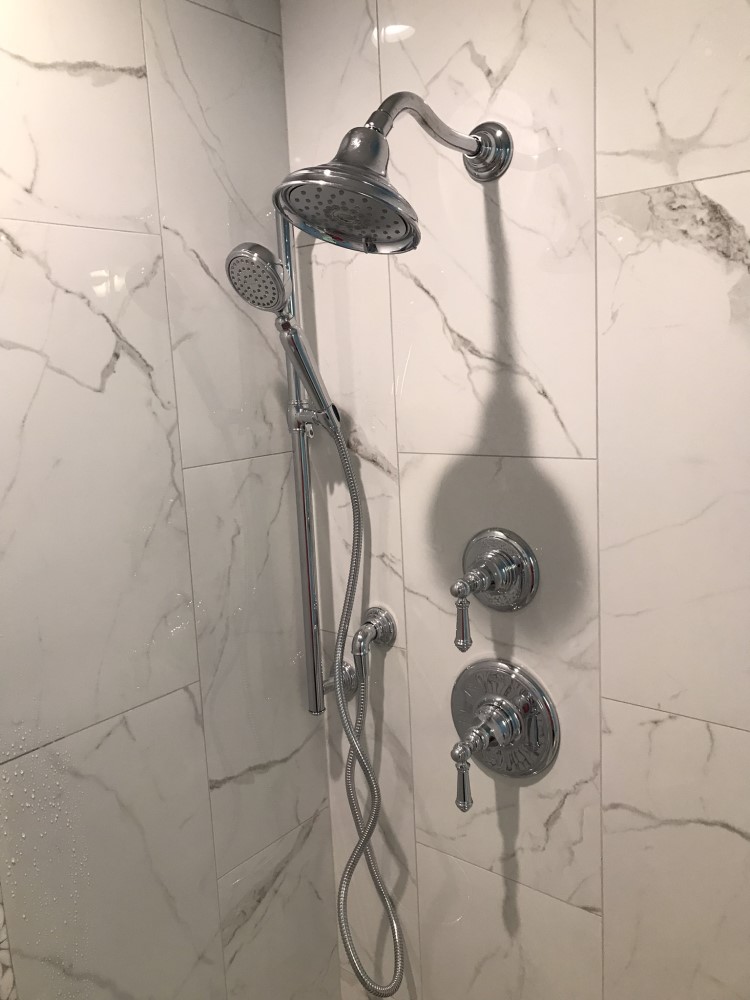
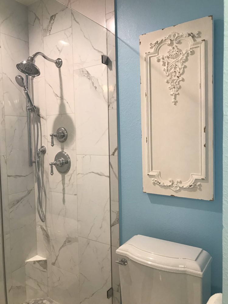
I selected shower fixtures with some vintage styling. The trim levers and hand-held system are from the Kohler Artifacts Collection. The three-function shower head was from the Kohler Bancroft Collection (CA compliant).
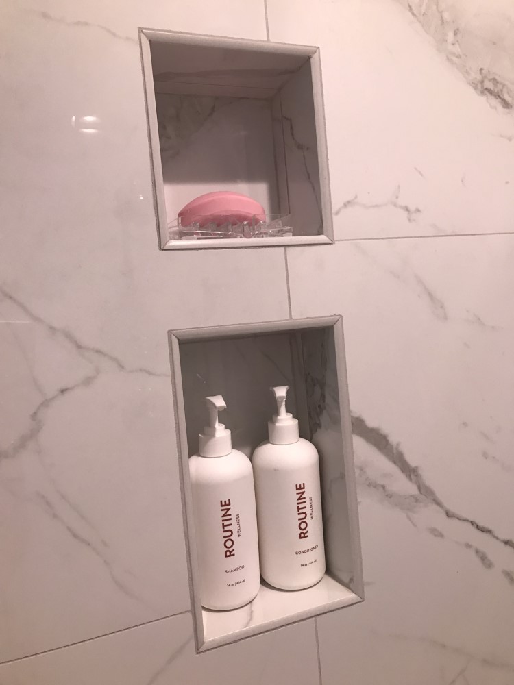
The shower niche was a detail that required significant compromise due to an existing gas line. The original plan for one horizontal niche turned into two narrow vertical spaces. They are small but worked for what I needed.
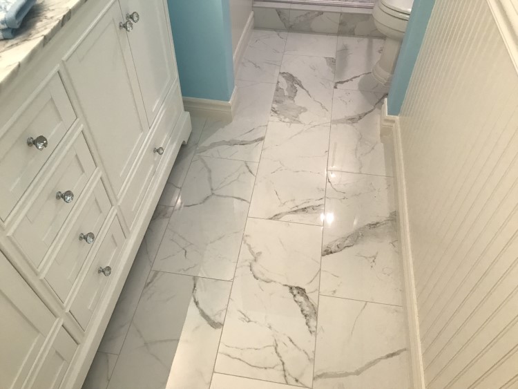
The floor tile was the same as the shower wall tile, Satori Statuario 12×24 inch polished porcelain, extending a crisp, clean look across the entire bathroom.
The paint used for the bead board and base board was Behr Swiss Coffee.
The Kohler toilet was retained from a prior remodel, because it was still in good condition and I couldn’t find a newer model that had a better design/Victorian shape. This Kohler model is no longer available.
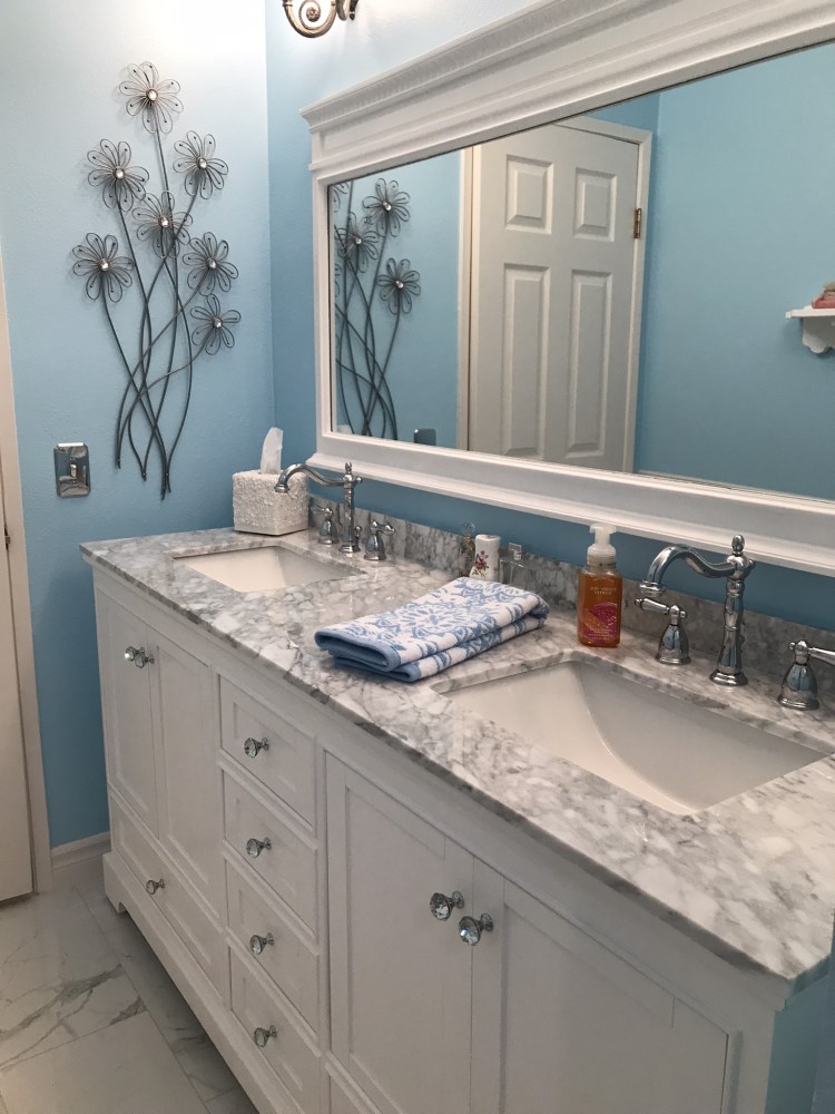
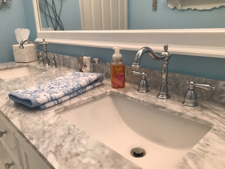
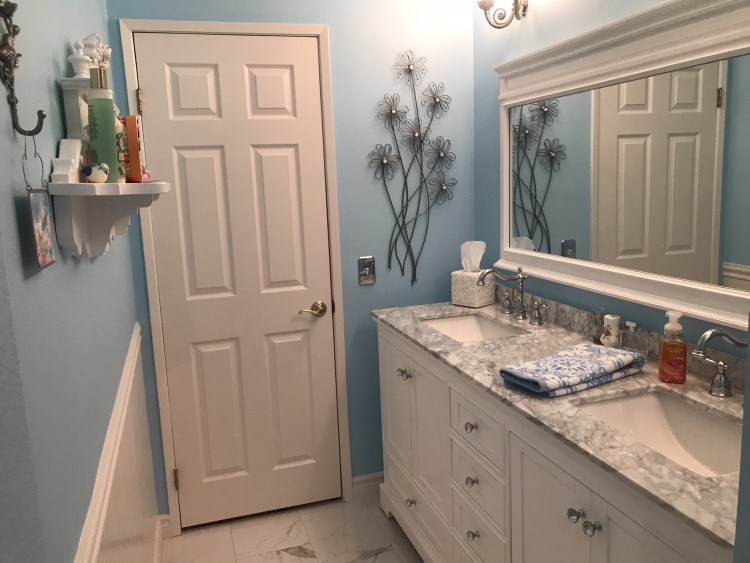
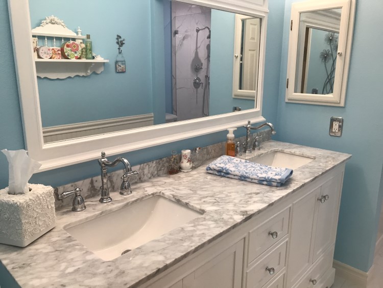
The vanity was an important selection, as I was moving from a wall-to-wall built-in to a free-standing unit in an 80-inch space. From the Wyndham Collection, I selected the Deborah model, 72-inch double vanity with a white Carrara marble top and square undermount sinks.
Although these vanities are sold nation-wide through home improvement and online stores, delivery is often handled through a third-party freight service. Many online reviewers complained of broken marble upon delivery, thereby needing to wait for replacement pieces. When I tried to order the vanity from Home Depot in person to bypass this process and request local store delivery, I learned it was not an option for this item. Additionally, the freight service would only agree to curbside placement, leaving me with another problem of how I was going to get it into the garage. So, instead I found a local store, My House Plumbing and Hardware who handled their own deliveries. They were able to pick up the vanity directly from the local Wyndham warehouse on the morning of my delivery, making the likelihood of breakage far less. They also had no problem putting it directly into the garage for me.
The chrome high-arc sink faucets are Kingston Brass Georgian. This model is exclusive to Lowes.
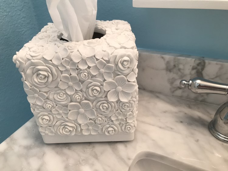
The sculpted white flower resin tissue holder was available from the Amazon Hymmah store.
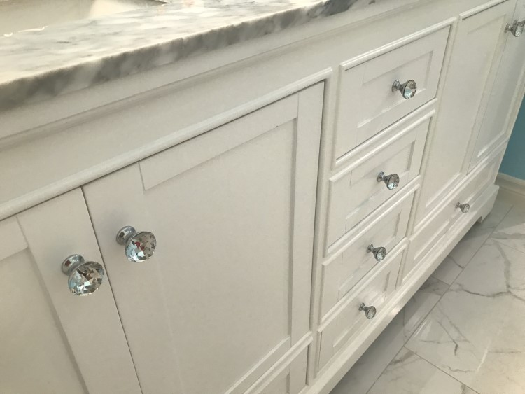
I thought these Liberty Solitaire chrome and crystal vanity knobs purchased at Home Depot, were reminiscent of antique glass drawer knobs.
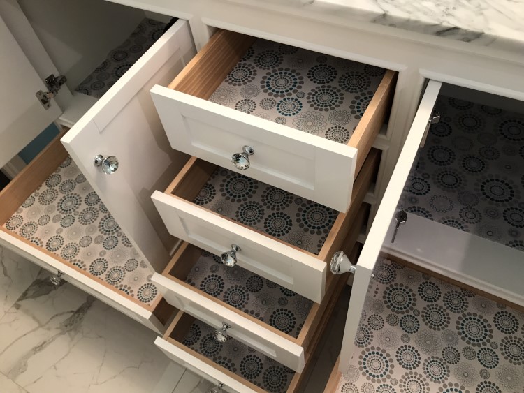
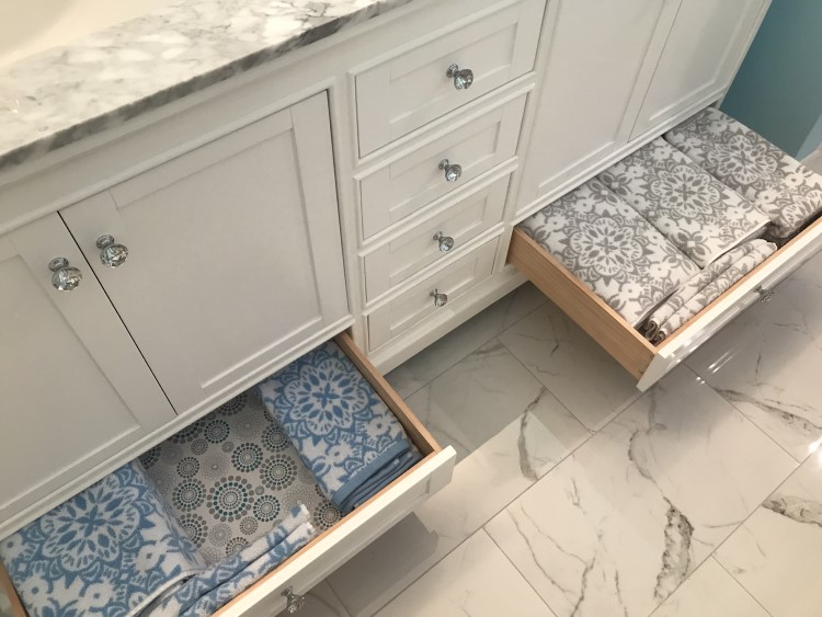
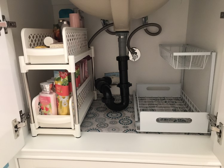
The drawer configuration of the new vanity makes efficient use of cabinet space. I used a fun retro patterned adhesive shelf paper to line each drawer. The matching waterproof pads were ideal for the undercabinet spaces. The “Gorilla Grip Peel and Stick Adhesive Removable Liner,” and the “Gorilla Grip Quick Dry Waterproof Under Sink Mat Liner” were purchased from the Amazon Gorilla Grip store.
I found the large flat drawers of the vanity perfect for my lovely new towels! These Jacquard bath towel sets were purchased from Lands’ End.
For the vanity undercabinet, I found some storage drawer options that would fit nicely into the tall but narrow spaces around the plumbing. Both were purchased from Amazon. The “Cheweetty Under Sink Organizer” has two plastic drawers in a unit just under 8 inches wide. It comes in a 2-pack. The “WZMYO Under Sink Organizers and Storage L-Shape Metal Slide” is just under 11 inches wide, and also comes in a 2-pack.
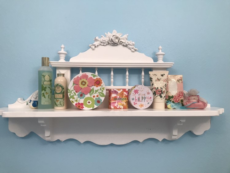
The Victorian shelf was a piece I retained from the prior remodel. The 60-inch-wide mirror was purchased at Home Depot and is from the Home Decorators Cailla Collection. It is sold with a white-wash finish, so I re-painted it Behr Natural White.
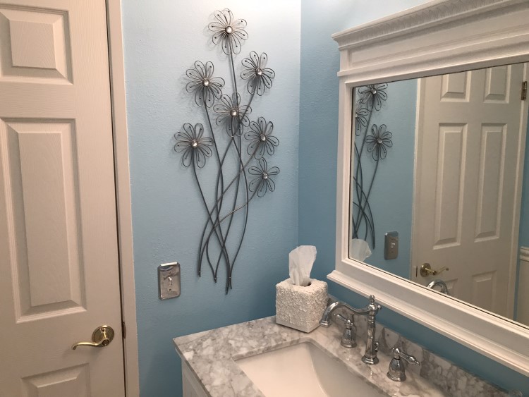
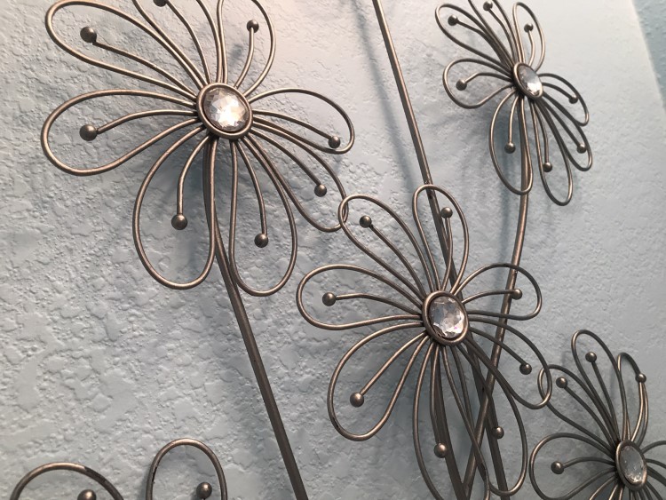
The daisy wall sculpture added a bit of retro or mid-century modern flare. It features metal flowers with crystal centers. I purchased this on Amazon from the Deco 79 store. It is described as “Metal Floral 3D Wire Wall Décor with Crystal Embellishments.”
The original finish was black iron, so I repainted it with an antique silver craft paint to match the pewter-colored light fixtures.
The two vintage-style bird on branch hooks were purchased on Amazon from the Boomlatu store. These were sold in a burnished-gold color and I repainted them with an antique silver craft paint. The wall paint was Behr Cool Water Lake adjusted 35%.
For additional wall decor, I purchased two framed Darby Home Daphne Brissonnet hydrangea bird watercolor-style art prints. These were available from Wayfair in white-washed frames. I repainted the frames with Behr Natural White to match the mirror.
I found the distressed French-style molded Prasoon wall panel on a few home décor websites, but it was always listed as “old of stock.” My best guess is that it was readily available a few years ago but is now harder to find. I tried to look for other wall fixtures, but kept coming back to this design as it really seemed to complement the other features I had planned. After much effort, I was finally able to locate a few being sold on eBay.
Here are a few before and after photos. What a difference four weeks makes!
The guest bath is now much improved in appearance and functionality, and I am very happy with how it all turned out! A special thanks goes out to Cavalier Builders, a family-owned contracting business specializing in kitchen/bath remodels. They did a phenomenal job of implementing my ideas and installing everything beautifully!
Lastly, here a few helpful tips of things I learned during this remodel: Dust will get everywhere and travel throughout the whole house no matter how much plastic you hang to separate the work space from your living space. I packed small table-top stuff away before the demolition began so that when everything was finished the house would be easier to clean.
Scheduling a remodel when the weather is pleasant can allow you to seek refuge in your yard when the noise, vibrations, or odors become uncomfortable. I spent many mornings enjoying my garden during this time, which helped lessen the stress of all of the construction commotion going on inside the house.
Resolve to be flexible. Demolition may expose unforeseen problems that will need to be resolved, or require you to make some changes to your design plans. Not everything will be perfect, but hopefully you and your contractor can work together to find solutions you can live with, when the plan goes awry.
Also, on the day they apply hot-mop, do yourself a favor and book a hotel room for the night-or two or three. The tar smell is very strong and will be with you for several days. You will need lots of open windows—another reason to consider weather/season when scheduling remodeling construction.
Updating a bathroom can be stressful and expensive, but it always adds value to the home. I hope this little tour of my project gave you some ideas, insight and inspiration for a remodel of your own!
On the journey toward home,
Lynn
